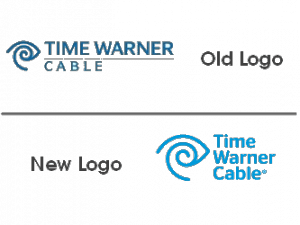
 Time Warner Cable has unveiled a new logo that is softer on the eyes and gives greater emphasis to “cable” in the company’s new look for the fall of 2010.
The new logo delivers a brighter, more contemporary appearance and adopts a font that looks a lot like Stag Sans Round by Christian Schwartz.
The Time Warner eye and ear symbol remains, but is more tightly integrated into the new logo, which is more square than rectangular.
Although the new logo appears more easy on the eyes, the fact the company spent some serious money hiring design agency The Brand Union to come up with it will certainly raise eyebrows from irate subscribers facing another round of rate increases from the company starting in January.
At least Time Warner Cable’s new logo is unlikely to get the same reception as the disastrous logo change undertaken by The Gap.
“After dominating the late 1990s and early 2000s, Gap has dropped its iconic logo in favor of something that looks like it cost $17 from an old Microsoft Word clipart gallery,” a source at the Brand Channel said.
The Gap changed the logo back after a week of derision.


 Subscribe